Tuesday, November 15, 2011

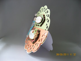
Ballet Dancer Card

My friend, Benjie, requested me to make her a
birthday card with an image of a ballet dancer that she can display on her desk. She used to take ballet lessons and told me that she misses her ballet dancing. So I came up with an easel card using a design from the online store which was perfect for Benjie's request. I love the color combination that I used, pink and dark chocolate brown. My favorite on the card are the ballet shoes. The shoes are a separate design which I also bought from the Silhouette store. I tweaked them using the node editing tool until they fit the feet of the ballet dancer perfectly. I created the dress using the same ballet dancer design. I created the frame using the same design used for the base of the card by doing an internal offset.

Here is a tutorial on the easel card:
http://www.splitcoaststampers.com/resources/tutorials/easelcard/


All the designs used on this card were purchased from 
the Silhouette store:

Ballet dancer: dancer_C20091017003545_2581
Ballet shoes: ballet_shoes_C20091016235517_2581 
Base of the card: 3_labels_C00800_20509 

Since all the designs on this card were purchased from the Silhouette store, I won't be able to share any file for this card. I do hope that you will still leave your comment :).


Note Pad Holder - A Nice Christmas Stocking Stuffer

Here is another great Christmas stocking stuffer project, a note pad or post-it holder. This is actually a great giveaway on any occasion. I've been crazy about the vintage look and used some distressing techniques on this project using Tim Holtz distress ink pads. I embossed the pattern paper with my Cuttlebug blending the color the distress ink with the colors of the pattern paper. The result is simply stunning! It gives that very chic vintage look on the paper. The cover or holder is a very simple template made in Studio using the rounded rectangle shape from the drawing tools. I hate using the perforated cut for the folds so I manually scored the folds of the holder with my Martha Stewart scoring board.  I used magnetic disks for the closure as shown on the video tutorial. I put a layer of paper on the inside flaps to hide the magnetic disks. I've seen other tutorials that used velcro instead. The embellishment is the other half of a Chinese button pair that you can find in fabric/notions stores. This is actually color white which I colored with ordinary dye ink pad using a foam applicator that's why the color matches the paper very nicely. The size of the note pads I used is 3" x 3". The ones made on the video tutorial were 2" x 2" which I'll be making, too. You can make the 2 sizes and bundle them with a ribbon which will make very cute presents. You can even personalize the holders by putting your recipients monogram on the cover.


Here is the video tutorial where I got the idea from:


I have the template in Studio file and can share it for free.

I only share my files with my blog followers. Just post a comment with your e-mail address indicating your request so I can send you the file. For those wishing to become a follower, just click on 'JOIN THIS SITE' right above my blog followers' list. Please make sure to double check that your name appears in my blog followers' list. If you don't see your name, that means something went wrong with your registration. Please make sure to check to follow 'publicly' and not 'privately' in the registration box otherwise your name will not appear in the followers' list. Please note that subscribing by e-mail does not put your name in the blog followers' list so it does not get counted. Again, to become a follower, you must click on 'JOIN THIS SITE'.

Happy crafting,
Ligaya

Monday, November 14, 2011

Angry Birds Card - Another Fun Kiddie Card

I made this card for my godson, Ranjeet, who is just crazy about the Angry Birds (along with every kid around). I really enjoyed making this card knowing how thrilled he will be. He loves it so much that he wanted to display it so I made a board for the card so he can hang it. I researched for the font of Angry Birds and was directed to the 'feast of flesh'. Here is a link to the free download:

http://www.1001freefonts.com/FeastOfFlesh.php


The Angry Birds images are just pictures of stuffed toys that I snipped and created in Studio with print and cut. I suggest using photo paper for bright and crisp iamges I created mats for the birds and welded them to the base of the card to hold each bird with the 'springy thingy' which makes the card kinda interactive which makes it even more fun and enjoyable.

I used the same 'springy thingy' on my swing and spin cards previously posted. I got the idea from Margaret Wilburn's blog. Here is her video tutorial on how to make it:   http://www.youtube.com/watch?v=a9NCjIF8rps&feature=player_embedded


All files used for this card can be shared, as always for free. Just indicate your request on your comment.


REMINDER: I only share my free files with my followers. You can sign up by clicking on 'Follow' (or sometimes indicated as 'Join This Site' depending on your browser) right below my blog archive on the right section. You can tell if your sign-up went through by checking if your name appears on my followers' or members' list. PLEASE always indicate your name, your e-mail address and user name that you used in my followers' or members' list on your COMMENT when requesting for the free files. This is the only way that you can be assured of receiving the free files.


Thursday, November 10, 2011

Christmas Family Tree


I can't believe that we are on the last 2 months of the year. Christmas is just around the corner which means, here I go again, frantic to come up with a design for my Christmas cards. Frantic, yes, as it is already mid-November and I don't even have a design concept yet. Most of these cards are being mailed abroad and snail mail just seems to be getting slower and slower every year :(.

While I'm trying to figure out my Christmas card design for this year, I'd like to share the wonderful Christmas project that I made for my family last year. I made a family tree using a very cute ornament design from the Silhouette store: 3d_photo_ornament_C00768_17986.

For those who are looking for a Christmas project, here is an idea for you.


Saturday, October 29, 2011

Frankenstein Halloween Treat Bag - Just Adorable!


I was actually doing a completely different
project when I chanced on the video tutorial of this super cute Halloween bag and I immediately decided to make them for my adorable nephews, Dustine and Dj (5 years old and 17 months old, respectively) who I'll be taking to a Halloween party on the 31st. They look soooooooo cute in their super heroes costume that I bought for them.

The inspiration for my Halloween treat bag is the Frankenstein box made by ChicnScratch on her video tutorial, http://www.youtube.com/watch?v=SG-_Jt0CoQ0&feature=related.

My version is much bigger than the one she made. She made 2 bags out of an 8.5" x 11" card stock. The finished size of the bag that I made is 8" x 7" x 3.5". I used 2 different colors for the front and back of the bag, each piece is 11 inches high and 10 inches wide. The folds on the sides and bottom of each piece are 2 inches. Instead of completely overlapping both pieces together as shown on ChicnScratch's video, I overlapped the front and back pieces only by half an inch, just enough to glue the pieces together, to have more depth to make the bag more spacious. For Frankenstein's hair, I used a grass design from the Silhouette store called Grass 1027 which was one of the free 50 files. I did a little tweaking that's why it looks different. For the mouth, I used the free shape of the week from the online store (pumpkin). I added the screws on his temples. They initially looked like his ears so I moved them higher. I took a close up shot so you'll get the idea on how to attach them. The allowance for the fold was already added to the shape. Instead of just drawing the mouth and the scars, I created cutouts. For the eyes, eyelids and the nose, I followed the way ChicnScratch did them. I used a one inch wide black ribbon for the handle instead of the same card stock so it will be stronger and will last longer.

As usual, I'm sharing the file for free. You know the drill. Just indicate your request on your comment.

REMINDER: I only share my free files with my followers. You can sign up by clicking on 'Follow' (or sometimes indicated as 'Join This Site' depending on your browser) right below my blog archive on the right section. You can tell if your sign-up went through by checking if your name appears on my followers' or members' list. PLEASE always indicate your name, your e-mail address and user name that you used in my followers' or members' list on your COMMENT when requesting for the free files. This is the only way that you can be assured of receiving the free files.


Thanks for dropping by.

Tuesday, September 13, 2011

Back To The Basics - Another Black and White Card

With my Silhouette SD now resting in peace, I tried re-living the pre-Silhouette era. It seems so hard to imagine how I can come up with a nice card without my beloved Silhouette. Well, it was, indeed, not easy so I cheated :-). I patiently rummaged through the ton of unused cut designs that I've been tossing into a small bin instead of the trash as I always feel guilty for being wasteful. I found pieces of this black frame with a birthday sentiment on it which were meant for cards that I never finished and eventually completely forgotten. The idea of another black and white card immediately hit me and the next thing I knew, I have a new card!

As the creative juices started flowing, I came up with another new ribbon style by cutting strips of fine ribbon, about 2.75 inches long, and glued the tips together. I used 6 folded strips to form like a quarter of  a flower held by a button as you can see on the photos. I happen to have this polka dot ribbon which was perfect for the card. I love my Cuttlebug but I have not used it as much as I should so I thought of making good use of it for this card. I used my Swiss Dots and Leafy Branch embossing folders, both by Cuttlebug. I used 4 layers of ribbons to cover the cut between the 2 embossed pieces. The first layer is a wide cream organza, second layer is a black organza, third layer is a cream ribbon topped with the same dotted fine ribbon I used for the flower ribbon. The black frame for the sentiment is from the set of Spellbinders Fancy Tags. BTW, this is not exactly a black and white card as I used a dirty white color which is a very light cream color.

This card speaks so much of the style of cards that I used to make before I started using the Silhouette machine. It's a nice feeling going back to my old roots :-).


Tuesday, September 6, 2011

Nurse Card

This was the card I was making when my Silhouette machine suddenly stopped working. I needed to finish the card so I made do with whatever I could. I rummaged through my stash and I was so lucky to find 2 layered tags that match the color scheme of the card. I redid the sentiments to match the size of the tags and to print the lines as well of the oval shape so I can cut them by hand. It's a good thing that the nurse I used doesn't have an intricate shape so it was pretty easy to cut it by hand. I found the metal flower brads which are perfect embellies for one of the tags. I thought I did a pretty good job making do with whatever I can in the 'absence' of my Silhouette machine. I was just happy to be able to finish the card.


The very cute nurse is a graphics that I purchased online from Sunflower Friends:  http://sunflowerfriends.com. There were 3 nurses in the file for only $0.80.They have a lot of super cute stuff. They have an ongoing sale for individual graphics for only $0.20 per file.

This card is for my niece for whom I made the graduation cap card when she graduated from nursing last April. I made this card to congratulate her for passing the nursing board exam.

I couldn't share any of the files used on this card as they are all Silhouette designs and the nurse is copyrighted, too.

Base of the card:   round_doily_C20091012222051_20509
Tag for 'You did it':  24_label_frame_tag_C00907_19210
Tag for 'Congratulations':  3_labels_C00799_20509

Tuesday, August 30, 2011

Cover For An Index Card Box

My friend, Benjie, requested me to make a cover for her index card box. She is a school teacher and she uses the box to store her index cards for her lesson plans and projects for her second grade students which they call the 'Item Bank'. She just told me about the box yesterday and I told her that I'm currently busy with multiple projects so I won't have the time to do the box till after about 3 weeks. Little does she know that I was so challenged with the design concept of the box that I immediately started on it as soon as I got home. I stayed up late and even missed my gym this morning just to finish the box. I enjoyed creating the cover design for my friend knowing how much she will appreciate and treasure the box.

I admire Benjie for her profession and not only is she a dedicated teacher, she truly enjoys her job and still has the same enthusiasm in all the 33 years that she has been teaching. She is, indeed, a remarkable teacher! These thoughts were my inspiration in creating this beautiful box and finishing it in one day. The box is a tribute to her dedication to her noble profession. It's truly a labor of love. I used a beautiful verse about teachers to embellish the interior of the box. I used all her favorite colors in the design.

I haven't told Benjie yet that the box is finished so she will be thrilled once she finds out.